Auckland 2020 Olympics
April 2020
> Branding > Iconography > Environmental Graphics
A proposed branding design for the Olympics hosted in Auckland, New Zealand.
Due to the COVID-19, the Summer 2020 Olympics will possibly be cancelled. In order to continue the Olympics as scheduled I created Olympic branding for a new host city: Auckland, New Zealand. The branding included a logo design, color palette, iconography, and environmental graphics.
Due to the COVID-19, the Summer 2020 Olympics will possibly be cancelled. In order to continue the Olympics as scheduled I created Olympic branding for a new host city: Auckland, New Zealand. The branding included a logo design, color palette, iconography, and environmental graphics.
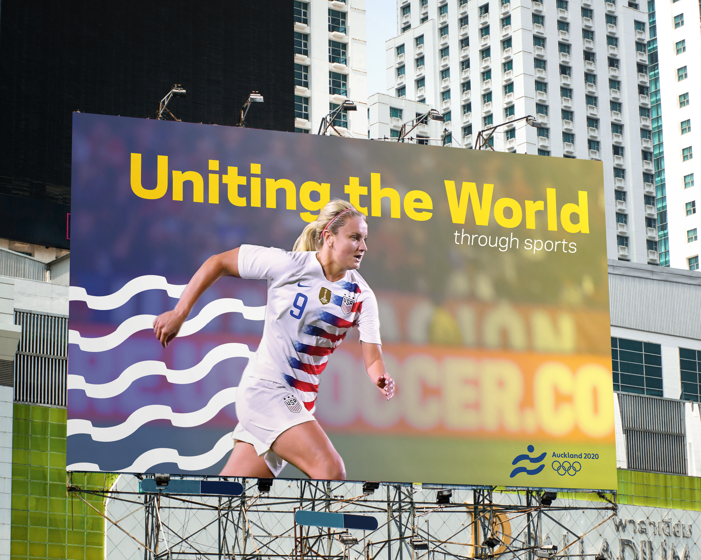
Visual Research & Experimentation
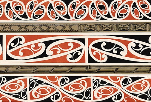
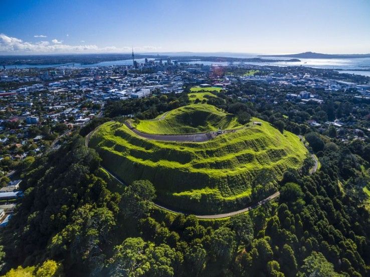
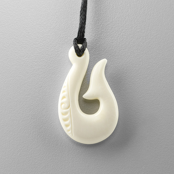
To begin my design process I conducted research on the history and defining qualities of Auckland. Through my research I narrowed my focus to the landscape of the country and the history of the Polynesian culture in Auckland. The organic shapes of the Polynesian patterns combined with the diverse geography inspired my branding.



Logo Design
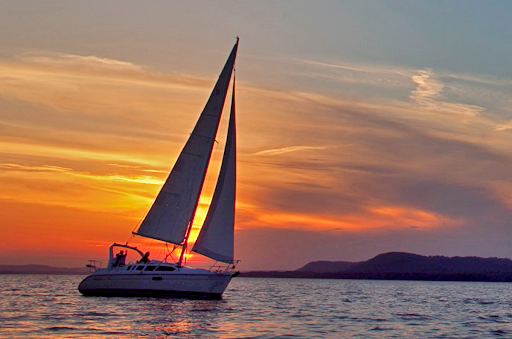
After conducting my preliminary research I began experimenting with various imagery. The first iteration of the logo designs was based on the nickname of Auckland: “The City of Sails”. After some further experimentation I focused on abstracting the landscape, through the flowing lines and a circle to represent the sun on the horizon. The icon
also resembles a figure running to represent the athleticism of the Olympic games.
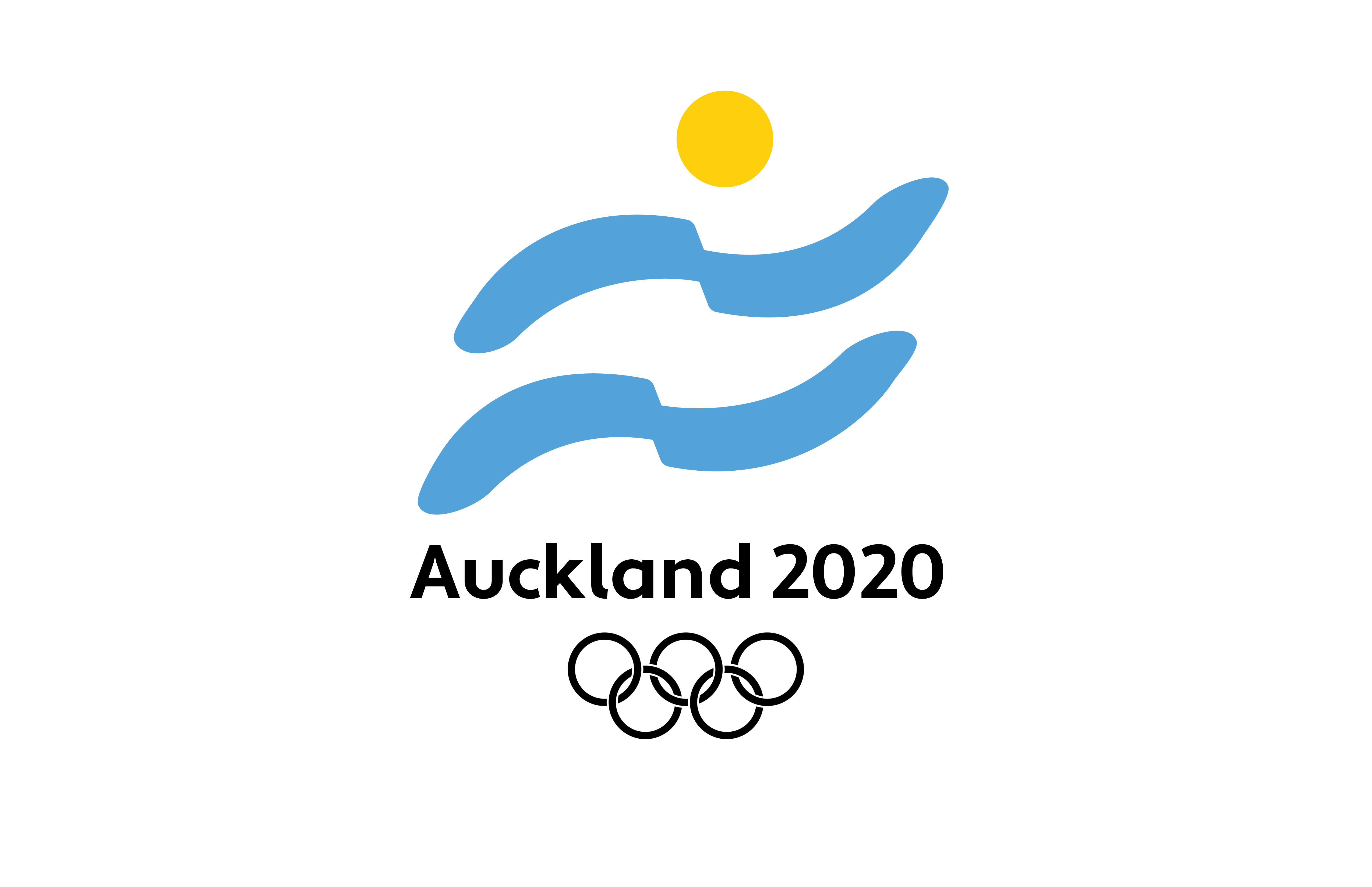 Primary Logo Lockup
Secondary Logo Lockup
Initial logo design explorations
Color Palette
The color palette for the Auckland Olympics is inspired natural geography of the city and traditional Maori patterns. I use a mixture of cool and warm tones to create contrast and balance within the branded materials.
Dynamic Applications
Based on the design system, I created a few applications of the branding in an environment and wearables. The applications allowed me to
explore how to use the brand elements in new ways to create interesting
advertisments, apparel, and branded spaces.
advertisments, apparel, and branded spaces.

Branded Tennis Court Space


