Juxtapose Collage Conference
October 2019
> Branding > Print > Motion Graphic
Juxtapose is a proposed collage conference that explores the connection between collage and typography.
Juxtapose is a proposed conference aimed at integrating the unexpected and eye catching visuals of collage with typography to encourage experimentation in design. Collage has a rich history of creating meaning
through surprising combinations of images, and the stud of those juxtapositions can inspire and inform new and innovative type compositions.

Deliverables: 24in x 36in poster, name badge, long sleeve t-shirt, motion graphic, and style guide.
Visual Research & Experimentation
To begin the design process I curated a collection of images, with a focus on analog collage. After conducting visual research I began to create my own collage compositions and scan them into the computer to incorporate into my designs.

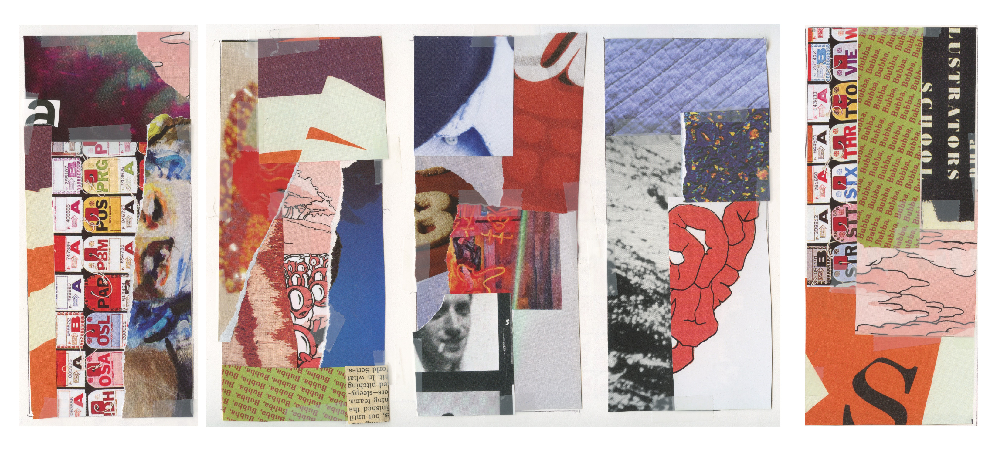
Analog Collage Studies
Motion Graphic
In order to experiment with a more diverse range of imagery I created a motion graphic. Creating an animation allowed me explore collage in a time based medium. Once I created the animation I paused the video at various frames to find new, dynamic compositions. The motion graphic inspired the use of the ripped up logo found in some of the final printed materials.

Style Guide
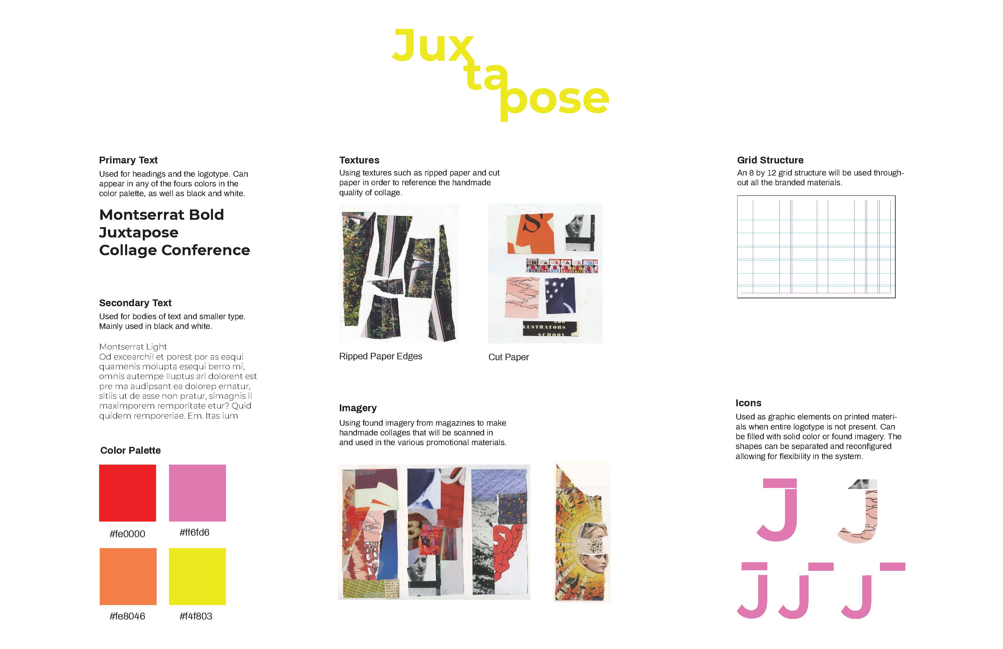
After conducting my initial visual research I began experimenting with color palettes, a graphic style, and typefaces for the branding of the conference. I initially used a vibrant color palette, but throughout the design process I narrowed the palette to a more muted color palette to draw more attention to the imagery on the final pieces.
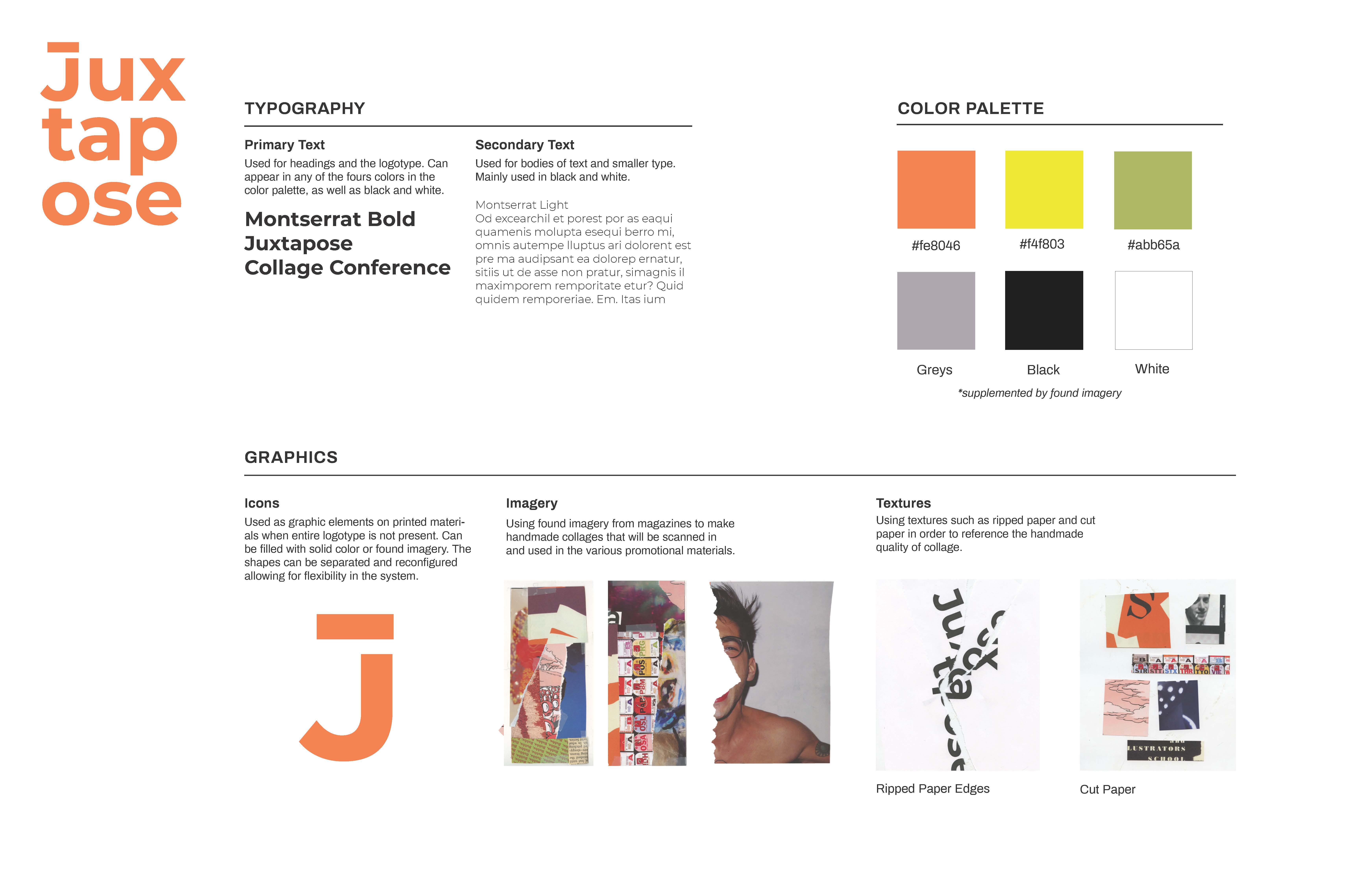
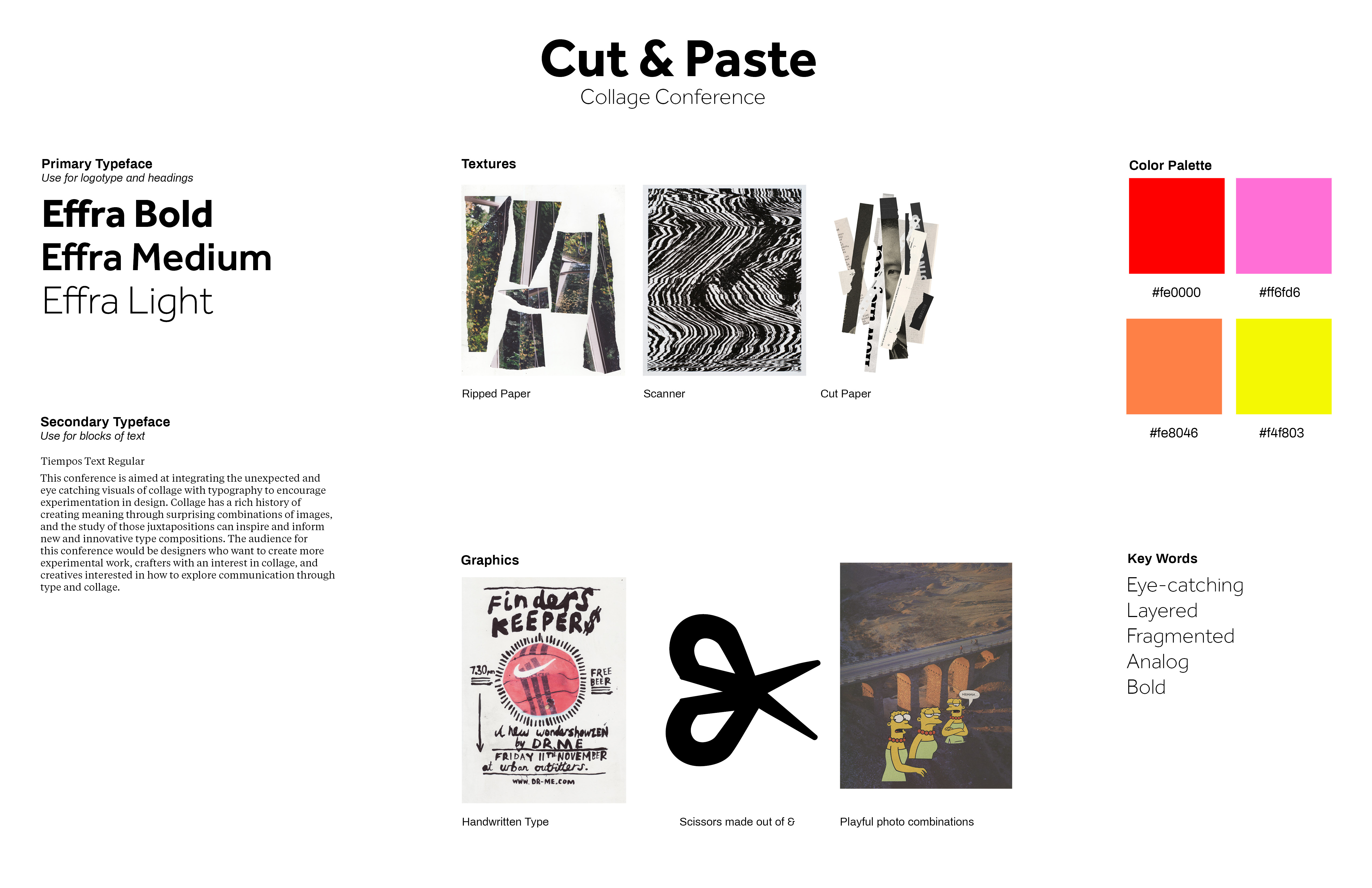 Early iterations of style guides
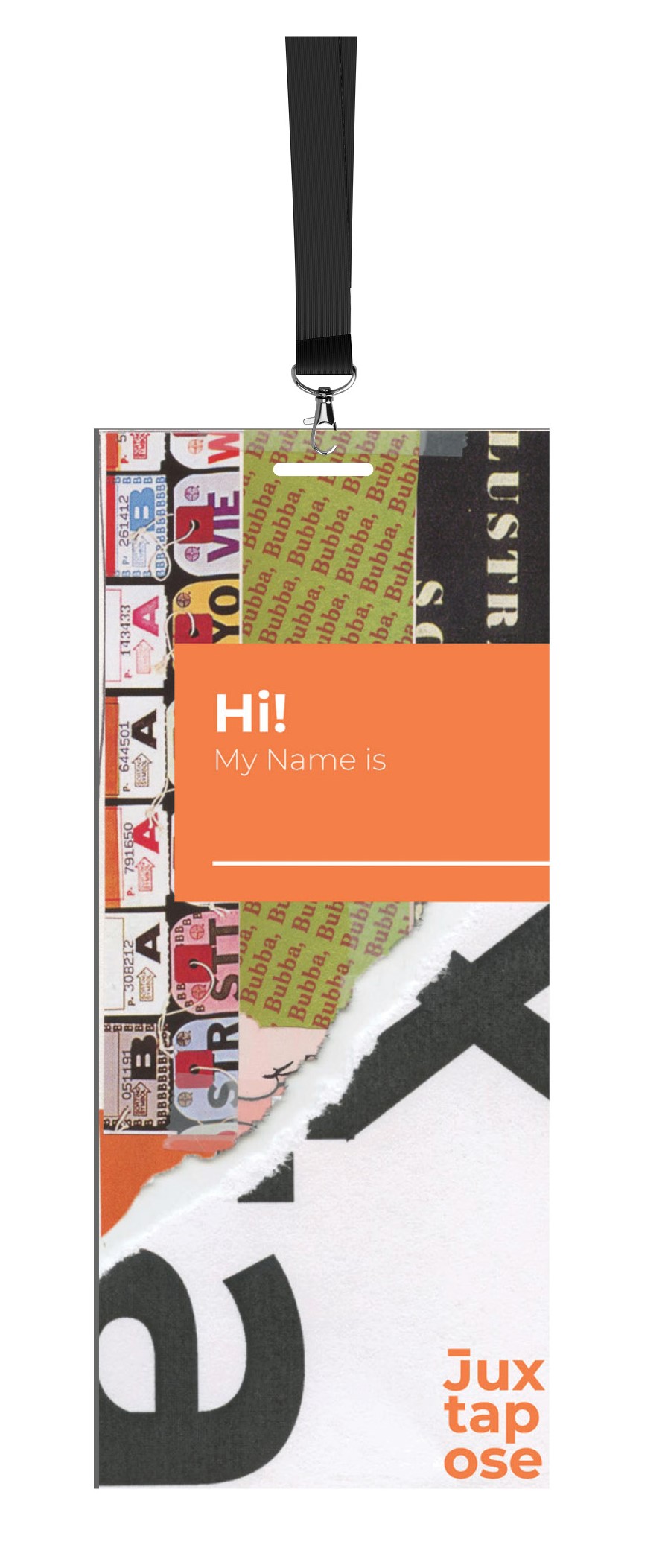
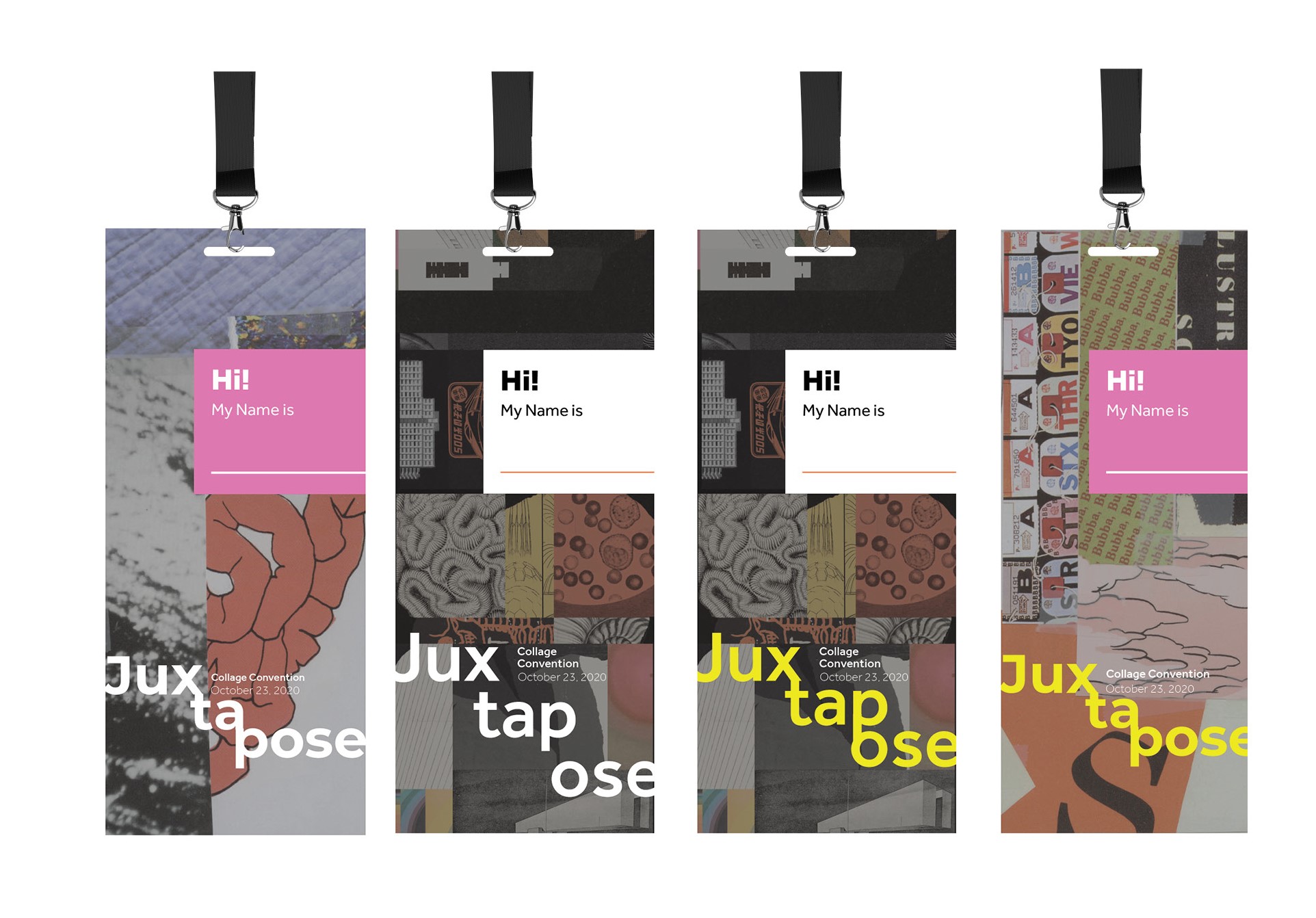
Name Badge
The name badge allowed me to explore to apply the working brand guidelines on a smaller scale (3 inches by 7 inches). When designing the name badge I considered the function of the piece. In order to provide maximum legibility
Apparel Design
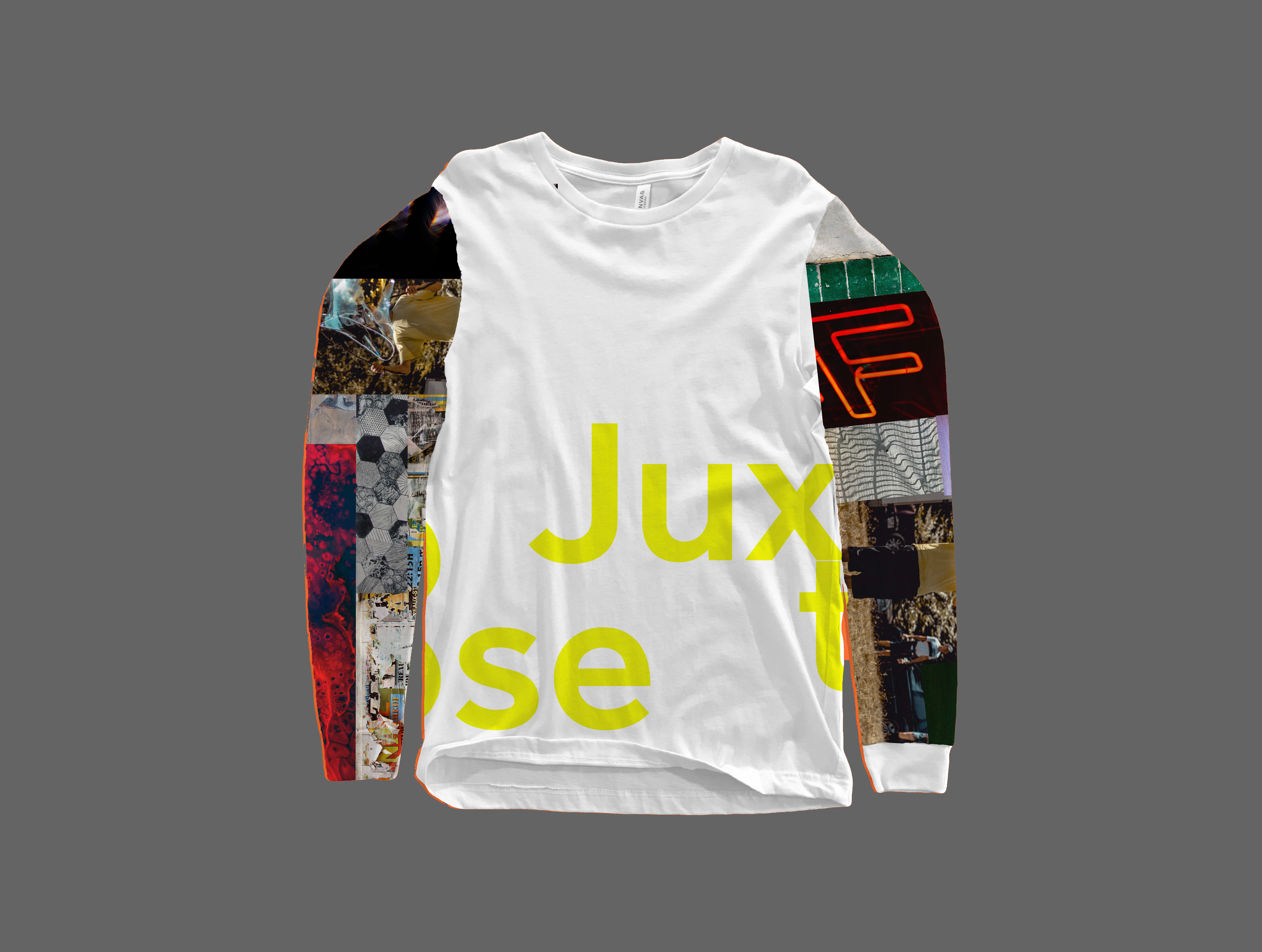
I was inspired by the different sections of a long sleeve t-shirt (sleeves and torso), and how I could use these sections to create a collage. In my early iterations I focused on incorporating imagery on either the sleeves or the torso. Ultimately, I decided to incorporate graphics throughout the shirt.
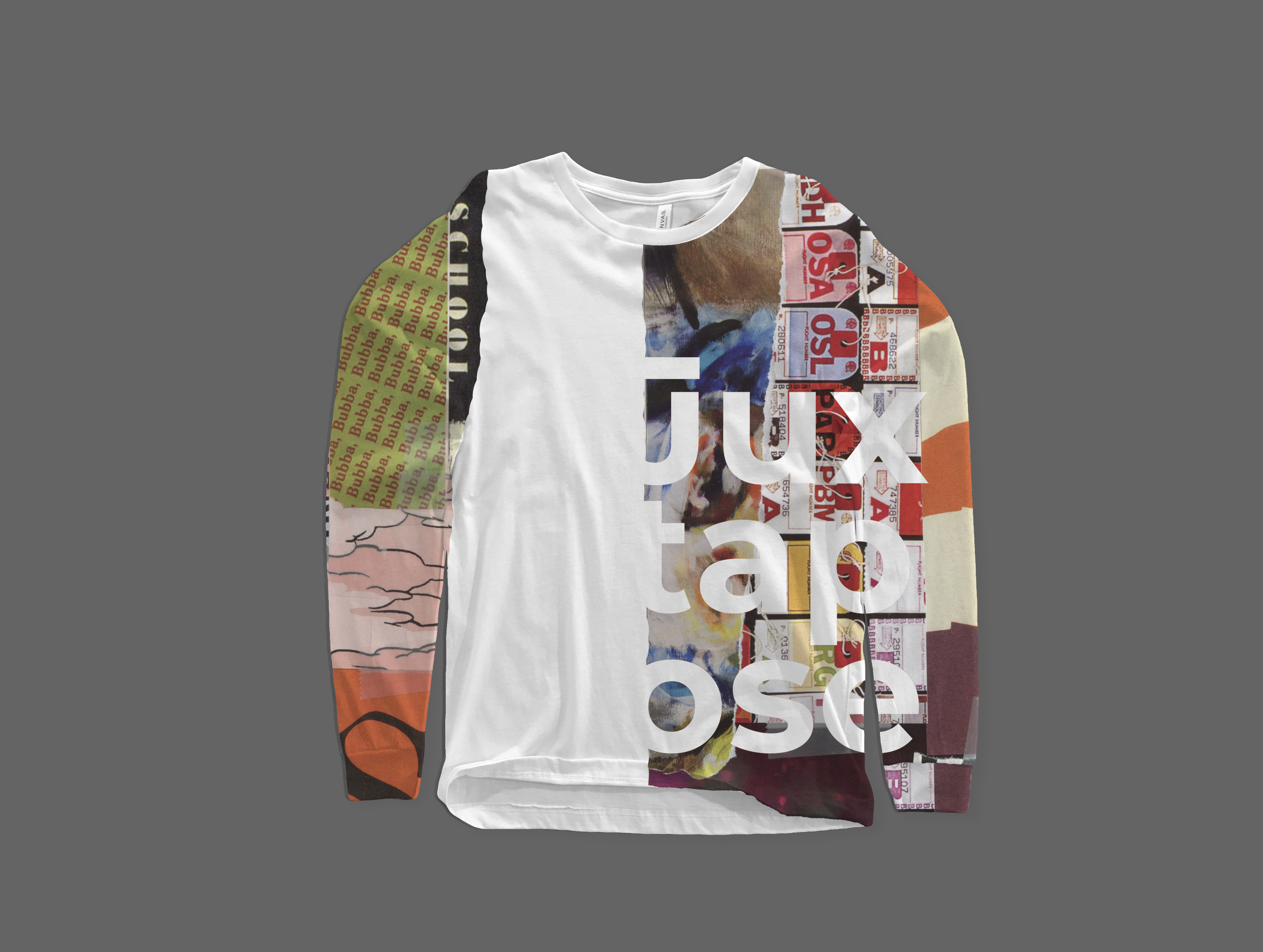 Final t-shirt design
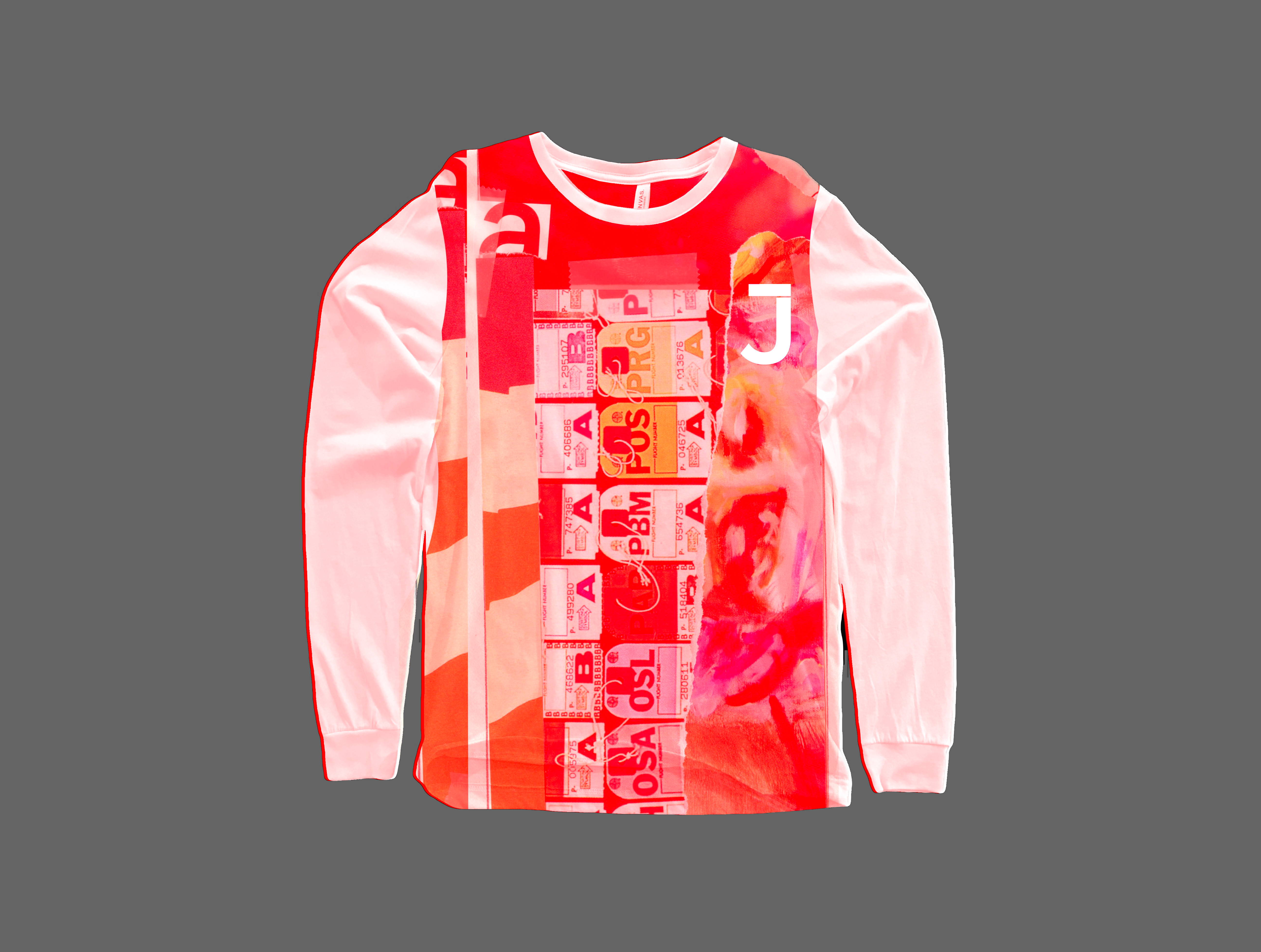 Early iterations of t-shirt design
Poster Design
The poster was the largest piece in the deliverables and it included a variety of information. The large amount of information challenged me to experiment with many different compositions and pushed me find a balance between legibility and readability.

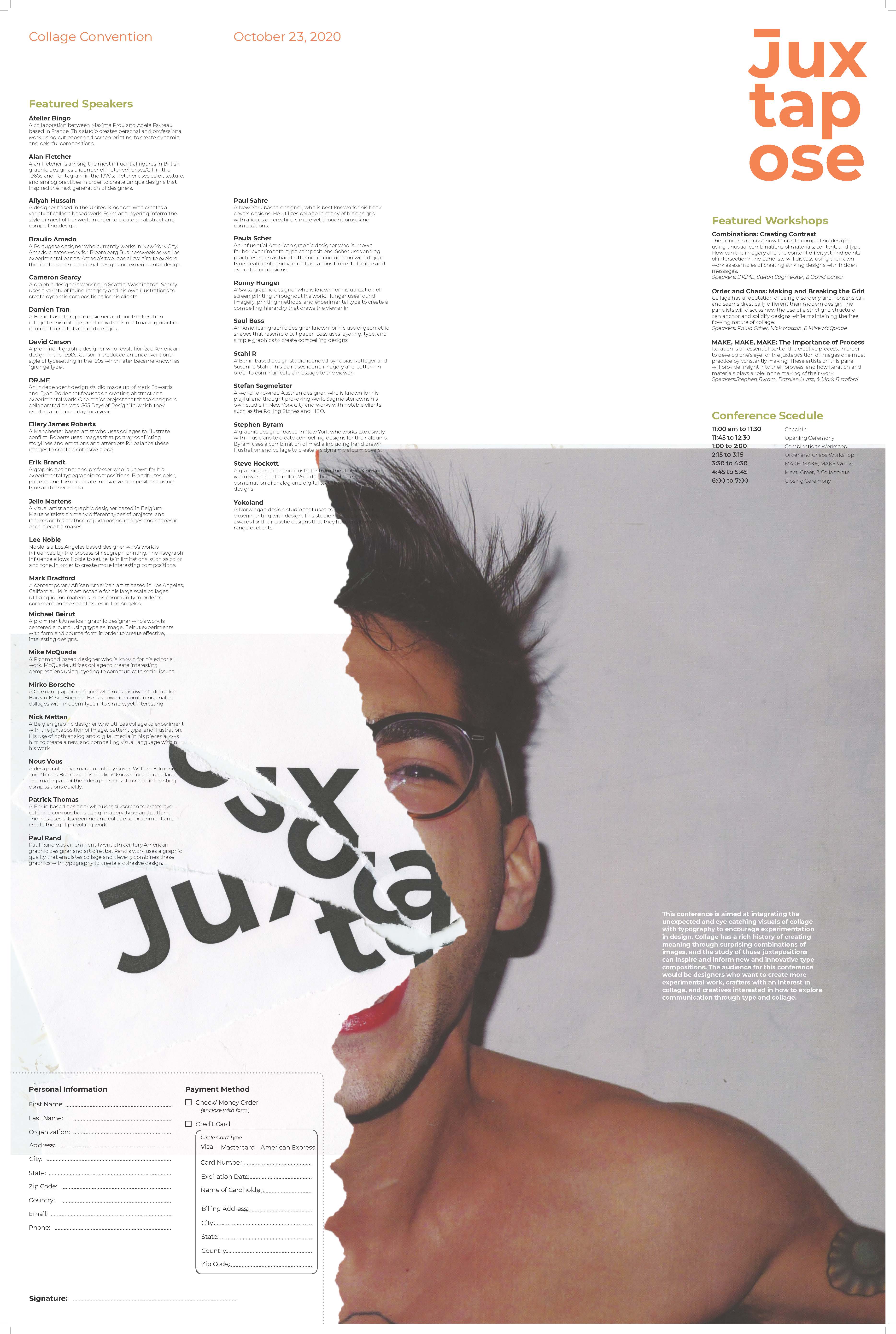
Early iterations of poster


